Clustermail

Finding Mail

Task

When we were discussing how to redesign an email client, it became soon obvious that we all wanted to do something completely new. Inspired by the BumpTop desktop environment our aim was to create a virtual environment, where you could effectively, yet jolly place your emails.

Clustermail makes
emails physical


Clustermail makes emails physical. They have a size, need space and can be stacked and sorted. The touching, moving and placing process helps you to deal with the mail. First it forces you to decide wether to keep it (assess the mail), second where to put it (sort the mail) and third it allows you to set up deliberate email cluster (make use of your intuition). Like on your desk you will know what your heaps are there for and hence get overlook the situation. Once you placed email, it will be easy to find your way back.

Since Clustermail relies on the spatial sense and you could actually touch your email on an iPad obliged us to choose this platform.

During this first stage of designing Clustermail we came to a junction, when we entered the screen design. To the left you could solve the visualization strictly graphically (»Clustermail-2D«). To the right you could reuse Apple visual patterns (»Clustermail-iOS«). We decided to go both ways, since both offer different insights.

We consider the Clustermail approach as feasible


Our Findings:

Clustermail is the attempt to actually visualize email workflows. Although the approach is challenged with the organization of (basically) endless virtual space that remains intuitive, we consider it feasible. The increasing amount and – simultaniously – importance of emails might render our approach more attractive. Eventually Clustermail applies the human spatial intuition to the classification of information.

Our Foresight:

The Evolution paragraph outlines a number of tasks that need to be tackled to actually build a programatic prototype. Some are conceptual question (organization of space), but most of them are about visualization (interaction and tools). Hopefully the constantly improving interaction capabilites of devices answers some of those questions in the future at ease.
Concept

The Boxmaps are the playground to organize your emails as you like


Clustermail is a prototype for a new concept. It is developed to show its potential – it is not ready-to-use (please see the Evolution paragraph). Concerning the workflow, we adapted some ideas from David Allen's GTD: Emails get assigned to projects and be processed later.

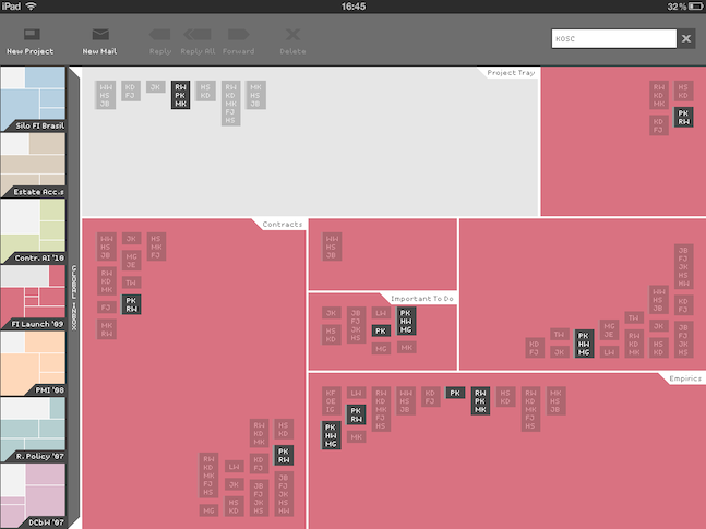
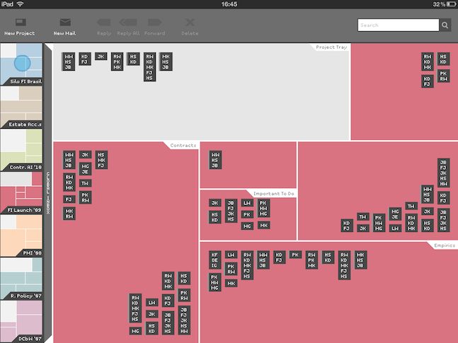
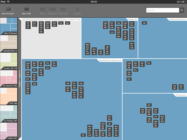
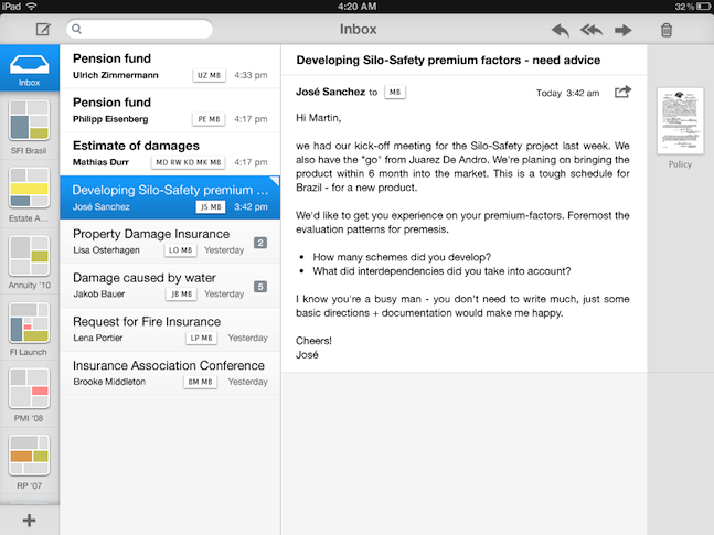
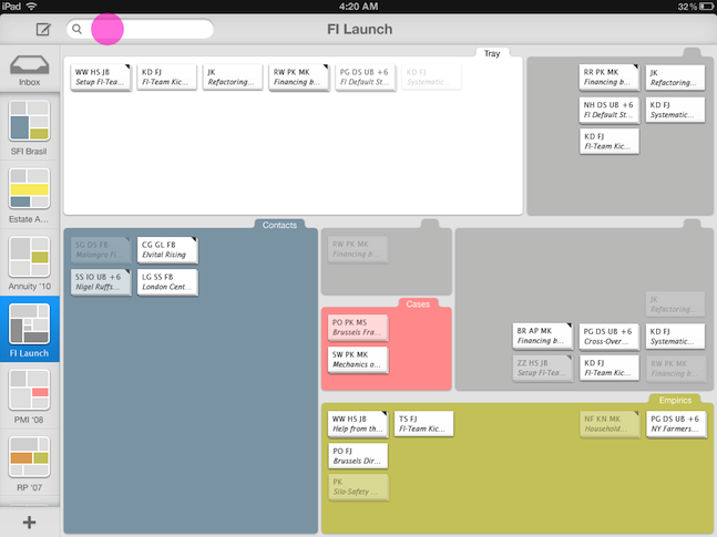
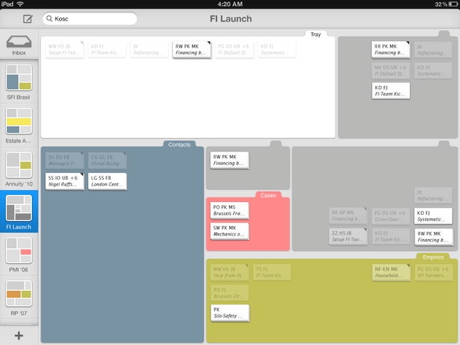
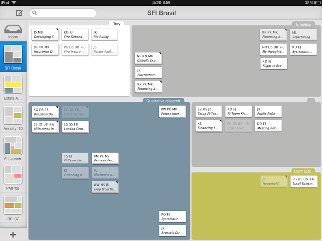
Clustermail comprises four major elements: There is the virtual desk that can be divided into sub-segments, the acquainted email-inbox which collects all incoming mail, an icon bar to use multiple desks (e.g. projects), there are email icons giving you hints about their contend.

The application relies heavily on drag and drop interaction and rarely employs popup-menus.

The Evolution paragraph below explains more on the derivation of the concept.

Global inbox


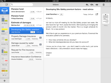
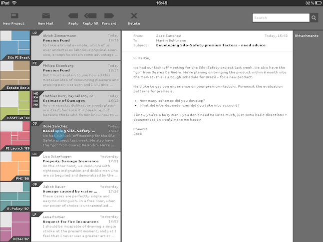
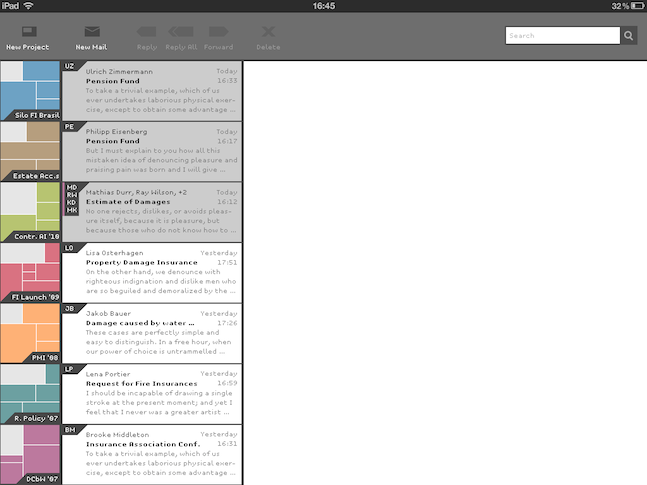
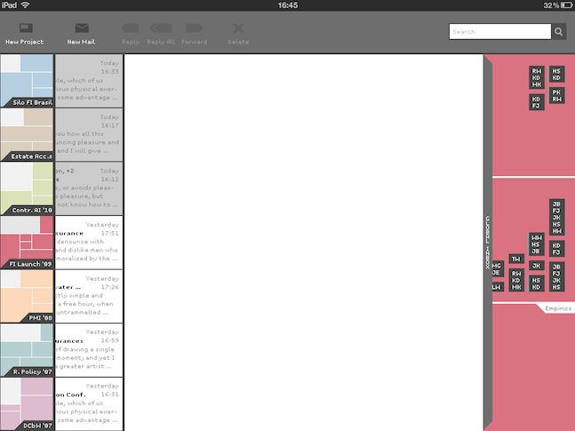
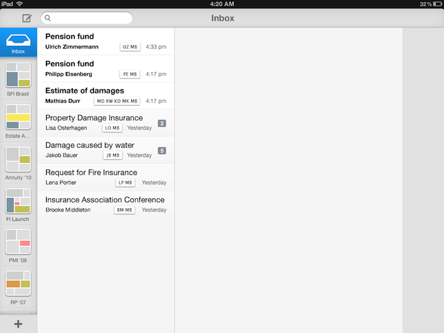
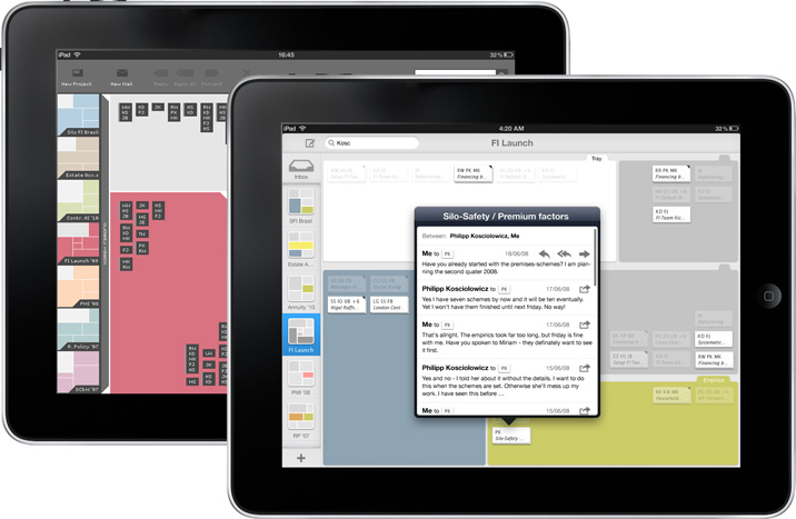
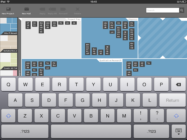
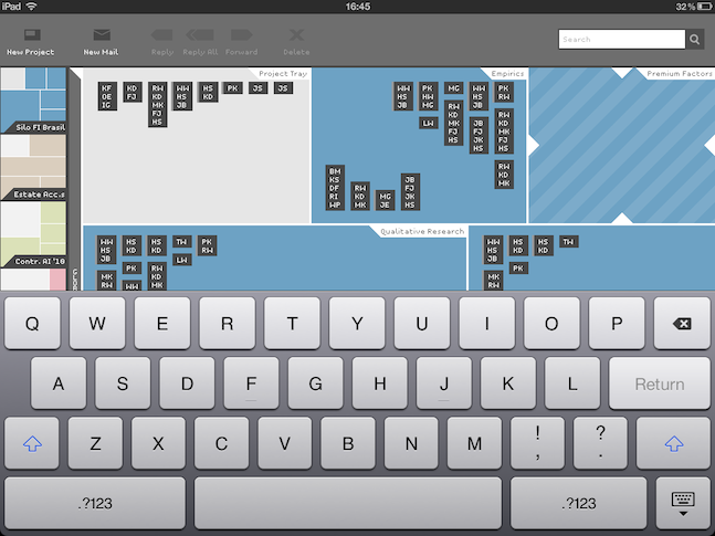
The global inbox represents the known email inbox. Each virtual desk also offers a place for unassigned emails called the »Project-Tray«. The latter offers to shift an email to a certain desk (i.e. project) without forcing you to file the email immediately.
Global Inbox

Global Inbox – Clustermail-2D

Global Inbox

Global Inbox – Clustermail-iOS

Boxmap


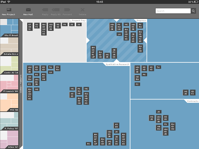
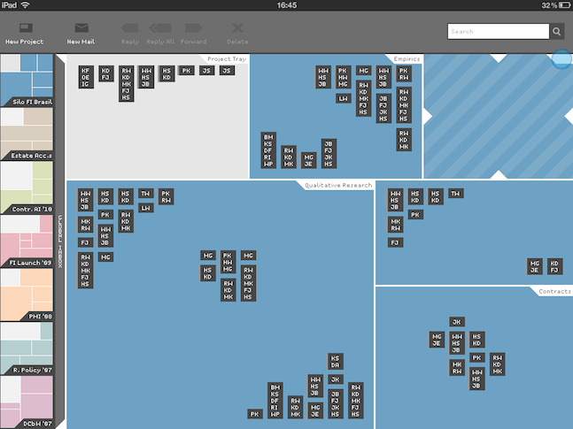
Boxmaps can be subdivided and the segments can be labeled


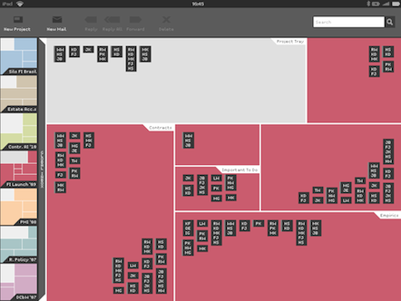
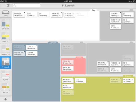
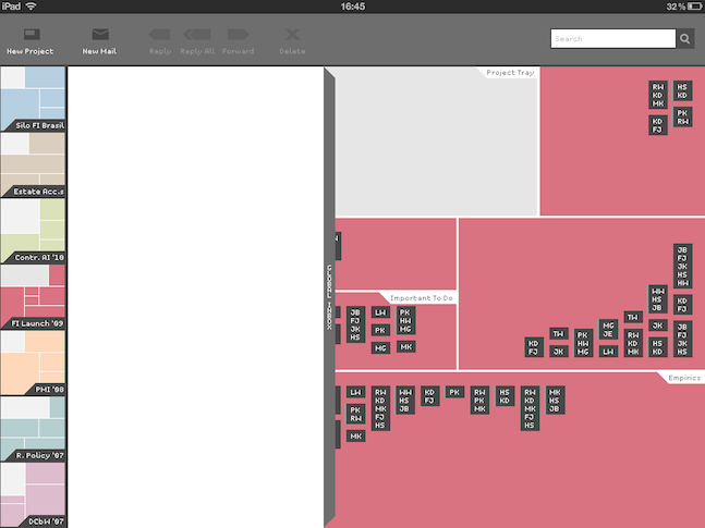
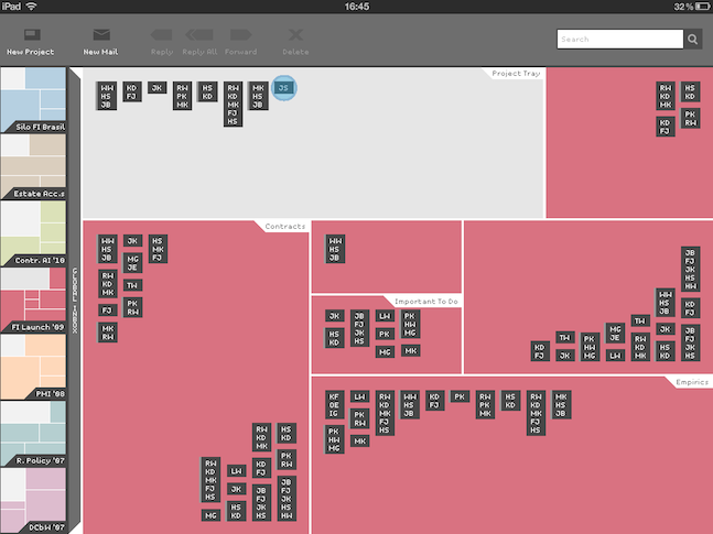
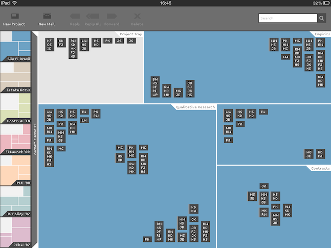
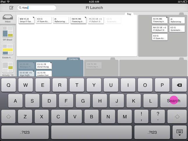
Our prototypes suggested that the virtual desk needed to balance space to deliberately position the emails and visual aids to distinct clusters. We finally came up with a square area which could be flexibly seperated into segments ("Boxes"): The Boxmap. Similar to a treemap the area and the segments can be split vertically and horizontally, always using the whole space. You can create, resize, order, name, delete boxes according to your needs. While Clustermail-2D applies different colors one different Boxmaps Clustermail-iOS offers colors to indicate different segments within an box map. Each segment carries handles to shift its boundaries. Other functions are applied through a popup menu. The segment in the top left corner is always the Project-Tray.
Boxmap

Boxmap Clustermail-2D

Boxmap

Boxmap Clustermail-iOS

Email Conversation Icons


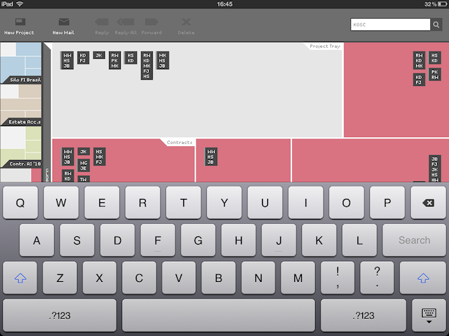
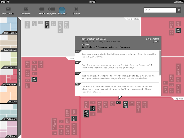
The card-like icons carry information about the participants (initials), attachments (Clustermail-iOS: grey edge) and indicate an email-thread (Clustermail-2D: grey vertical line, Clustermail-iOS: stacked cards). Vis. B further offers the first characters of the subject.

Icons

Icons Clustermail-2D

Icons

Icons Clustermail-iOS

Project Bar


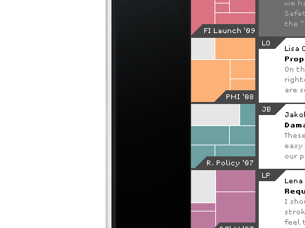
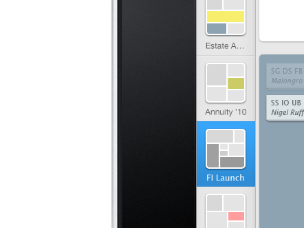
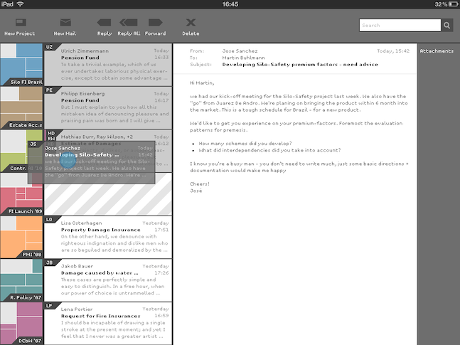
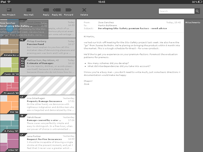
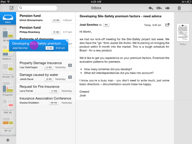
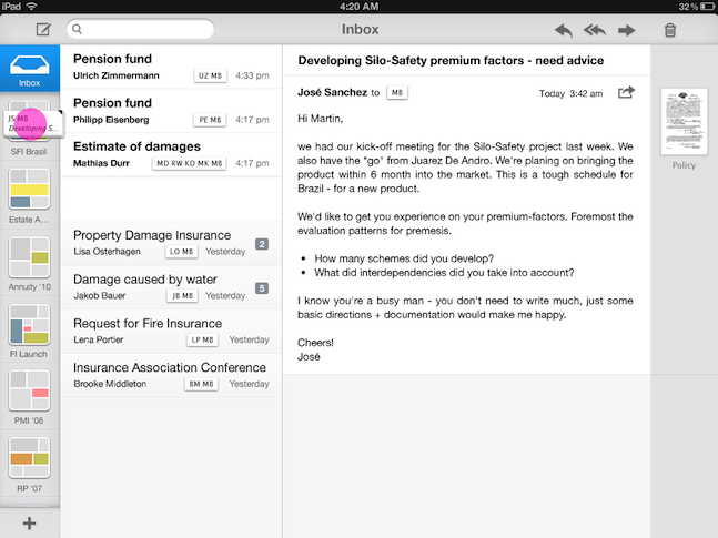
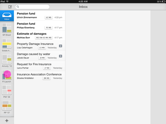
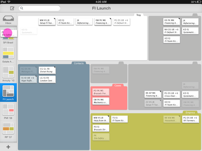
The vertical project bar on the far left displays all Boxmaps in use – if necessary you can scroll the bar up and down. A simple touch will display the appropriate Boxmap. Dragging an email onto an Boxmap-icon moves it into the Boxmap's Project-Tray.

Project bar

Project bar Clustermail-2D

Project bar

Project bar Clustermail-iOS

Workflow

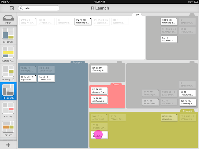
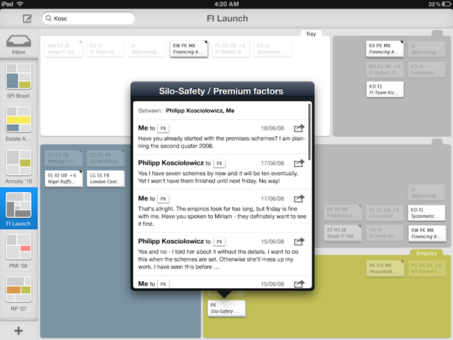
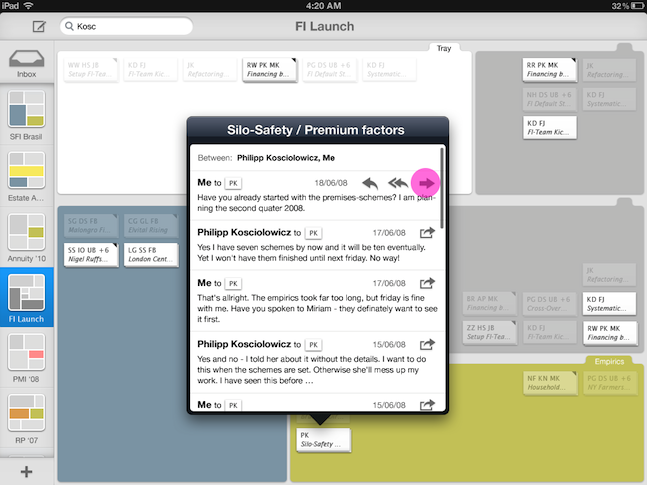
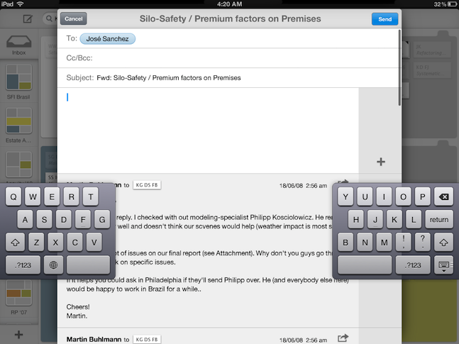
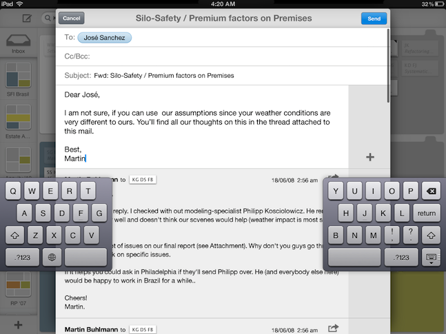
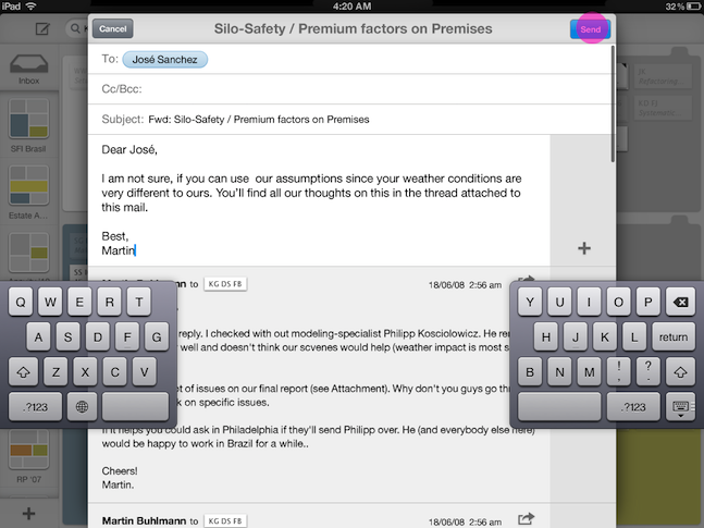
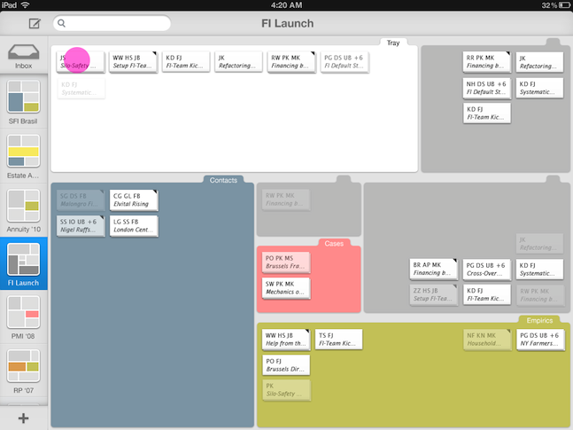
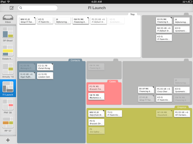
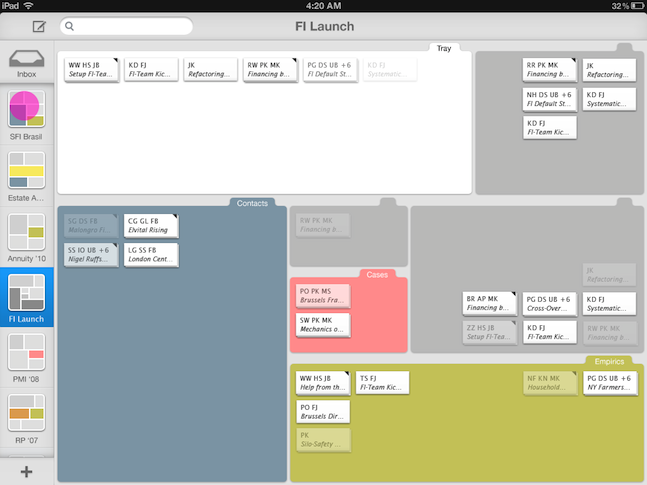
The two slideshows display the use of Clustermail. If you like to see full resolution screenshots, you can download them here.

Evolution

After proving that the concept is feasible we needed to reinvent basic interactions to handle the virtual space


Clustermail challenged us in two aspects: In the beginning we needed to prove the concept was feasible. As we became confident we were confronted with reinventing basic interaction patterns. At this point managing the design process meant to reduce complexity. We ignored lots of sidestories to focus on one usecase to demonstrate the concept's potential. Eventually the reducing part has been far more challenging than the inventing part. It often meant to build on unknown ground and – as Professor Müller put it – just trust our intuition.
The design process started with sofa discussions, continued with a paper prototype, wireframes and ended with screen design.

Paper prototype

The Boxmap


Bridging the gap between your finger and the virtual space


BumpTop joyful access to digital work has been very inspring. Meanwhile it raised our awareness for the giant gap between real an virtual world. If you print all your important mails, your desk will never be sufficiently big to place them properly. How can we use the advantages of the virtual desk to solve this problem without losing the intuitiveness of real world desk? In addition the paper prototype (real world!) revealed the limits to our memory: What did this heap mean, again?

Introducing segments helps you organizing your mails but also raises the complexity


It became clear that we had to move a way from the plain desk to something more subdividing. Our answer, the Boxmap, brought up further questions: How do you handle placed emails in a segment, which is reduced to make up a new segment? Zoom them out until they fit into the smaller segment? The recursive idea of the Treemap suggested to put a further Boxmap into a segment of a (superior) Boxmap. This is technically simple and would immediately solve the limitation of space. But how do you visualize a segment which contains further Boxmaps? How do you navigate through the Boxmap-levels? We developed some solutions – and grew confident that there we can solve the rest.
But then, with the wireframes we had to waive the recursive Boxmaps again and arranged with space limitation. The scene design further challenged the use of distinguishing colors, typography, interaction toolset and visualization model (i.e. 2D/3D-resemblance, "visual story") and platform limitations (finger size).

The Email Conversation Icons


Another issue was the design of the email icons. How do you balance size and helping information? Do remember attachments? How do you distinct a conversation from a single email? Our two versions offer different answers.

Tools And Interaction


We spared further interessting aides, such as a chrono-filter, to finish the prototype


The interaction toolset has been cut down to its essential parts. The paper prototype indicated the need of a collecting folder for semi-important mails: Keeping yes, but not worth placing. We dropped that feature with the wireframes.
The input through touching limits the accomodation of context-sensitive functions severly. You don't want micro-buttons or cascading menues. We ended up using the classic iOS popup. It's not a beauty, but it works.
The scrollable Project-Bar and the position of the Global-Inbox symbol, easy in Clustermail-iOS, became difficult to visualize in the straight 2D model of Clustermail-2D. We eventually went for an animated Global Inbox.
A chronological filter was planed in the beginning, but was abandoned for limitation of scope. This filter was designed as double slider on a timeline, where you could also overview the distribution of mails over time. You'll still find this feature in the wireframes.